When PeopleSoft was born, the cell phone was a telephone the size of a brick, and PeopleSoft was manually installed on individual PCs. Fast forward a couple of decades, a cell phone is called a smartphone, a smartphone is so slim it fits into a pocket, and PeopleSoft is accessible on a smartphone! It is a real-life version of Back to the Future!
PeopleSoft kept in line over the years with technology advances, and its latest incarnation of PeopleSoft Fluid User Interface (Fluid UI) does not disappoint. Released with PeopleTools 8.54, Fluid UI is a simple, accessible user experience optimized to run on any device (desktop, laptop, tablet, smartphone). Fluid UI makes pages easier to navigate, requires less training than original PeopleSoft navigation, and provides a framework for users to interface across PeopleSoft applications (HCM, Financials, Campus Solutions). For organizations on PeopleSoft, the intuitive user experience delivered with Fluid UI is a game changer.
As I work with clients to deploy Fluid UI, I am continually amazed how this new experience allows users to be more efficient in using the PeopleSoft system. Here are my favorite efficiencies from Fluid UI:
Streamlined user interface and navigation. Historically, the design of PeopleSoft pages included as much information as possible on a single screen, so users didn’t need to navigate to multiple areas. Over time, I have learned this “overabundance” of information was counterproductive. The data was too much, and many users struggled to find critical information to perform the task at hand. Fluid UI has solved this problem as it is a fresh outlook on day-to-day application use. The pages are simple, and users can easily find information to make business decisions. Furthermore, it’s reassuring that Fluid UI follows progressive disclosure standards from commonly used websites (i.e., interaction design patterns often used to make applications easier to learn and less error-prone).
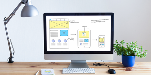
Accessible, responsive design enabling use on smartphones and other devices. Magnified by COVID-19, we know user workloads are no longer solely performed on office desktops. The work travels from the office to the home-computer, tablet, smartphone, etc. This means PeopleSoft needs to work on all these devices. Fluid UI fulfills this necessity by dynamically adapting to the size of each device. Not only does PeopleSoft look better, but my clients started to use PeopleSoft more and with greater efficiency. With the pandemic, this functionality has been priceless.
Robust dashboards and meaningful reporting capabilities. If I had to pick a “favorite” function within Fluid UI, it would be the new display for reporting and analytics (a.k.a. Fluid Dashboard). I always dreamt of reports and analytics being simple to read and understand. Fluid made this dream a reality as it allows institutions to create customized dashboards using simplified analytics that help users understand their data and make informed decisions. For example, cash managers can quickly access an institution’s cash position, cash forecasting, and investment data for making day-to-day decisions anytime, anywhere (e.g., bank transfers).
Bottom line: Fluid UI = a simplified interface that is more accessible, mobile, and intuitive. Move your organization’s PeopleSoft applications to Fluid UI and empower users with the freedom to do more, anytime, anywhere. Contact Sierra-Cedar for a free Fluid UI demonstration and estimate!
